Why This Book
Some books don’t just teach you things — they quietly reshape how you think.
Zero to One is one of those books for me. It’s sharp, opinionated, and uncomfortable in the best way. The ideas inside it are bold, but the way they’re delivered is incredibly clear.
This redesign was my attempt to translate that mindset into a visual form.
No noise. No gimmicks. Just intention.
The Goal
The objective wasn’t to “modernize” the book or outdo the original design.
It was to ask a simple question:
What would this book look like if its ideas were expressed purely through restraint?
I wanted the cover to feel:
-
Confident, not loud
-
Thoughtful, not decorative
-
Timeless, not trendy
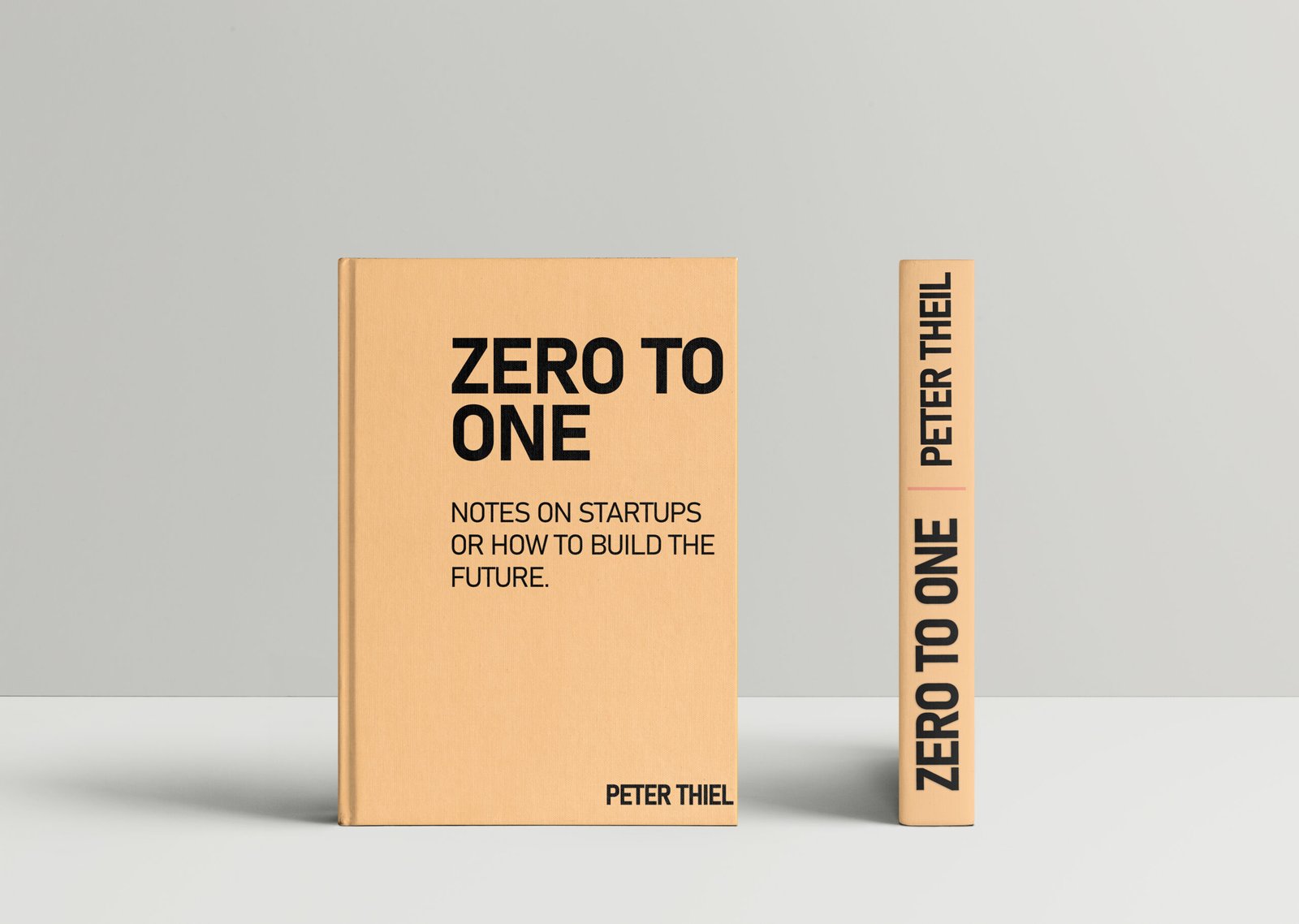
Design Thinking
1. Minimalism With Purpose
The concept relies heavily on negative space and strong typography. The absence of visual clutter mirrors the book’s core philosophy — moving from nothing to something meaningful.
Every element exists for a reason. Nothing is there to fill space.
2. Typography as the Hero
The title “ZERO TO ONE” is bold and unapologetic, set to command attention without shouting.
The subtitle is secondary, supportive — just like the structure of the book itself.
Typography here isn’t styling. It’s structure.
3. Color & Material Feel
The warm, muted tone gives the hardcover a tactile, almost archival feel — like a book you keep on your shelf for years, not one you skim and forget.
It’s intentional, calm, and serious — just like the ideas inside.
4. Spine Design
Special attention was given to the spine because real books live there most of the time.
Clean alignment, readable typography, and balance ensure it stands strong even when shelved.
What This Project Says About Me
This project reflects how I approach design in general:
-
I value clarity over complexity
-
I believe less, done right, is more
-
I design from meaning first, visuals second
It’s not about impressing at first glance.
It’s about staying relevant after the first look.
Tools & Skills Used
-
Conceptual Design
-
Editorial & Book Cover Design
-
Typography & Hierarchy
-
Minimal Visual Systems
-
Product Mockups
-
Adobe Photoshop
Final Thoughts
This wasn’t a commercial project.
It was a personal exercise in restraint.
A reminder that strong ideas don’t need decoration — they need space to breathe.
And sometimes, the most confident design decision is knowing when to stop.