The Idea
This project started as a simple thought:
What if design wasn’t treated like a service, but like a feeling?
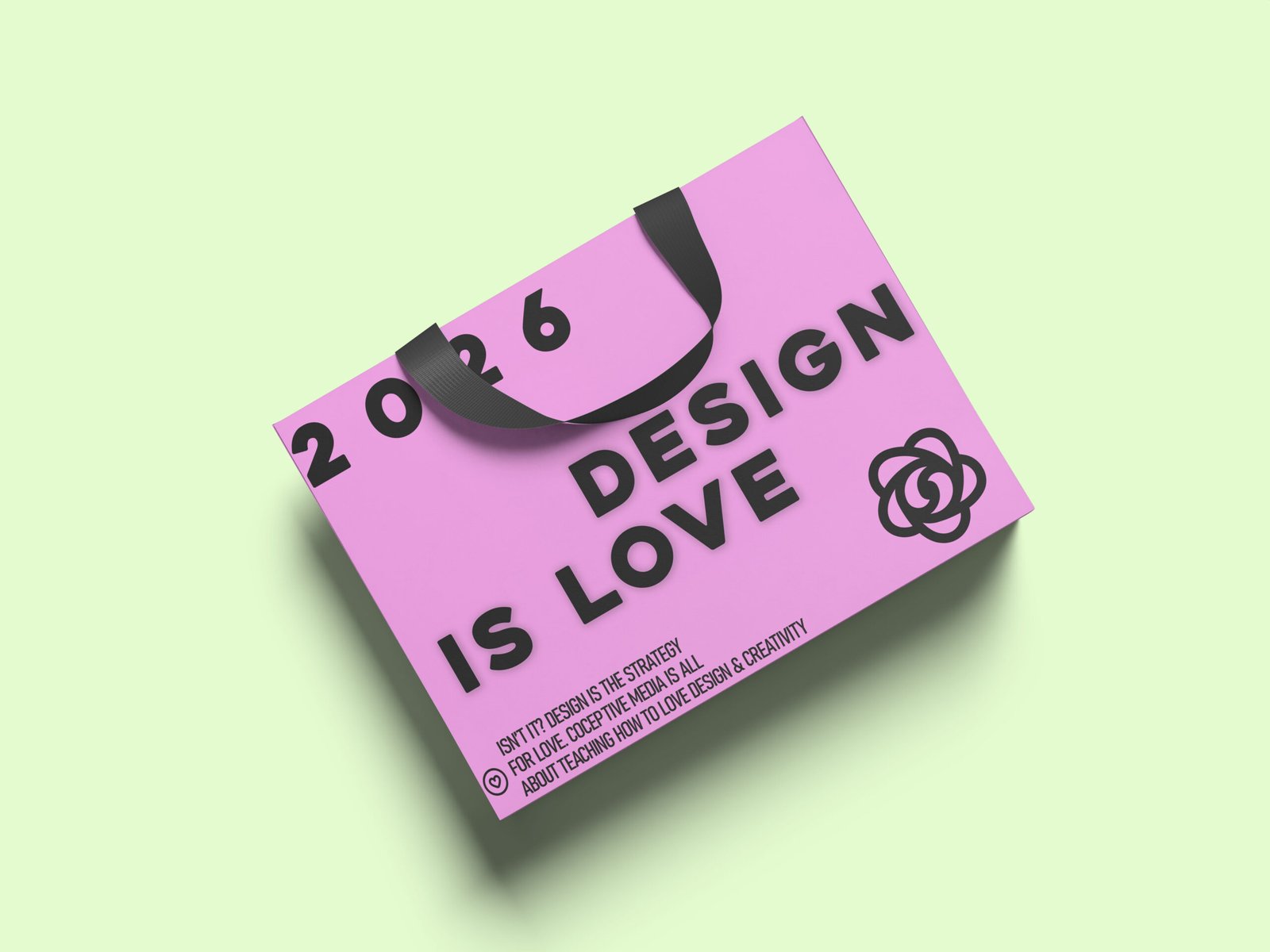
“Design Is Love” is a personal concept project created for my portfolio—not for a client, not for a brief, but as a reflection of how I genuinely see creative work. The year 2026 hints at the future, but the message is timeless: design works best when it’s driven by emotion, intention, and care.
Why I Created This
As designers, we often talk about strategy, systems, grids, and metrics—and all of that matters. But behind every good design is something human:
-
curiosity
-
empathy
-
love for the craft
This mockup was my way of expressing that belief in a physical, tangible form.
Design Approach
1. Typography First
The entire design revolves around bold, confident typography.
There are no distractions—just a clear statement that owns its space. The text feels unapologetic, almost poster-like, because the message itself doesn’t need embellishment.
2. Color Choice
The soft pink base brings warmth and approachability, while the black typography grounds the design and keeps it sharp.
The contrast reflects how design works in real life—emotion balanced with structure.
3. Layout & Hierarchy
-
“DESIGN IS LOVE” sits at the heart of the composition
-
The year acts as a subtle timestamp, not the hero
-
Supporting text stays minimal, almost like a quiet footnote
Every element knows its place. Nothing shouts unnecessarily.
4. Mockup Execution
The shopping bag format was intentional. Bags travel. They move through cities, stores, and hands.
This design isn’t meant to stay on a screen—it’s meant to be carried, seen, and felt.
The Message Behind the Design
At its core, this project says one thing clearly:
Good design isn’t just about looking good.
It’s about caring enough to do it right.
Whether it’s branding, packaging, websites, or visuals—when love is part of the process, it shows.
What This Project Represents
This concept reflects:
-
My belief in emotion-led design
-
My preference for clarity over clutter
-
My approach to branding as storytelling, not decoration
It’s not loud.
It’s not overworked.
It’s honest.
Tools & Skills Used
-
Concept Development
-
Typography Design
-
Color Theory
-
Branding Thinking
-
Product Mockups
-
Adobe Photoshop
Final Note
This wasn’t designed to sell a product.
It was designed to say something.
And sometimes, that’s the most important kind of design.