Project Overview
This project is a self-initiated packaging mockup created for my personal portfolio to explore premium product storytelling through visual design. The concept reimagines a limited-edition Christmas Special coffee tin for Davidoff, blending festive warmth with the brand’s refined, premium identity.
The objective was not to redesign the brand, but to extend its visual language into a seasonal collectible product that feels celebratory, elegant, and shelf-worthy.
Design Objective
-
Create a holiday-exclusive packaging concept that stands out while remaining brand-consistent
-
Balance luxury minimalism with playful festive illustration
-
Present the product as a giftable, limited-edition collectible
-
Showcase my skills in packaging design, mockups, and visual hierarchy
Concept & Inspiration
Christmas is emotional, nostalgic, and vibrant. Instead of relying on conventional reds and predictable holiday motifs, the concept focuses on:
-
Storytelling through illustration
-
A sense of joy, warmth, and celebration
-
A visual contrast between clean premium branding and rich, colorful artwork
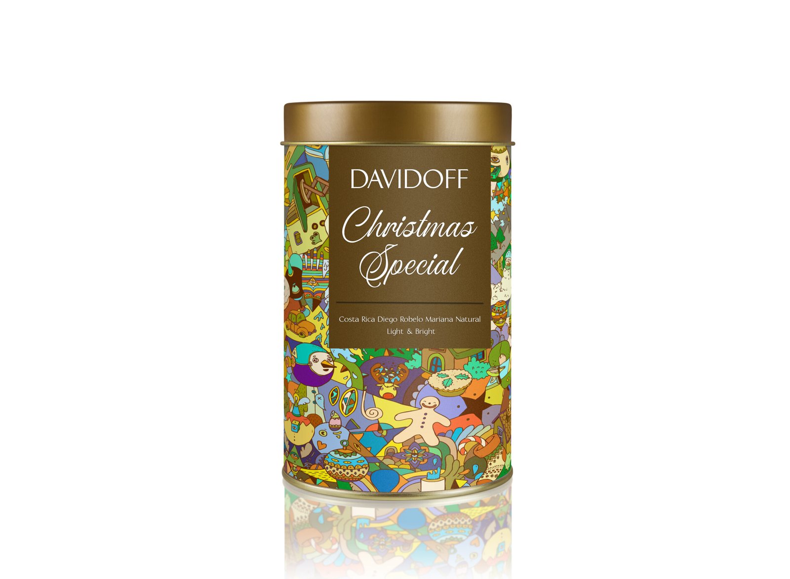
The illustrated wrap symbolizes festive chaos—music, sweets, characters, and celebration—while the central label anchors the design in sophistication.
Design Execution
1. Typography & Branding
-
The Davidoff logo and product name are kept clean, centered, and understated
-
Script typography for “Christmas Special” adds a handcrafted, festive feel
-
Subtle hierarchy ensures instant readability without overpowering the artwork
2. Color Palette
-
Metallic gold for the lid and label conveys luxury and exclusivity
-
A vibrant, multicolor illustration wraps the tin to create contrast and energy
-
Neutral label tones allow the artwork to shine without clutter
3. Illustration Style
-
Playful, abstract characters and holiday symbols evoke warmth and nostalgia
-
The dense illustration makes the tin feel collectible and premium
-
Designed to feel joyful up close and striking from a distance
4. Mockup Realism
-
High-quality lighting and reflections enhance realism
-
Cylindrical form showcases label placement accuracy
-
Presentation is optimized for portfolio, branding decks, and digital showcases
Outcome
The final mockup presents a premium festive coffee product that feels:
-
Gift-worthy
-
Collectible
-
Brand-aligned
-
Emotionally engaging
This project demonstrates my ability to:
-
Translate brand values into seasonal design systems
-
Combine illustration, typography, and product mockups seamlessly
-
Conceptualize packaging that works both visually and commercially
Tools & Skills Used
-
Packaging Concept Design
-
Branding & Visual Hierarchy
-
Illustration Integration
-
Product Mockups
-
Adobe Photoshop / Illustrator
Why This Project Matters
This case study reflects my design philosophy:
“Good packaging doesn’t just hold a product — it tells a story.”
It showcases how a strong brand can be extended into limited-edition experiences without losing its identity, making it ideal for premium, lifestyle-driven markets.